Dynata Managed Full Custom Dashboards
From basic scorecards to fully customized, executive-ready dashboards, Dynata’s Data Visualization capabilities transform your survey data from numbers in a spreadsheet to visually stunning, branded graphics that allow you to tell a richer, more compelling story about your findings. When using Dynata for your Data Visualization needs you can expect:

Faster Insights
Quickly turn raw survey data into clear, interactive visualizations for easier analysis and improved decision-making.

Enhanced Storytelling
Present compelling data narratives with dynamic charts and graphs that bring key findings to life.

Improved Data Accuracy
Reduce manual errors with automated data processing and visualization tools.

Customizable Reports
Tailor visual reports to fit specific audiences (internal stakeholders, clients).

Seamless Integration
Combine survey data with other business intelligence tools for a more comprehensive view of customer insights
Brand Research
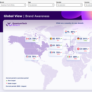
Global Brand Tracker, measuring key brand funnel KPIs across both regions and against competitors.
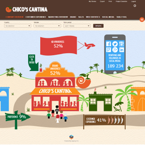
Vibrant dashboard, showcasing how visual, interactive, and custom-made you can be with our solution.
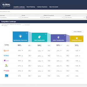
Get an instant look at the competitive landscape, including NPS score, consumer perception, and more.
Ad Testing
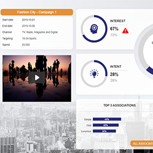
Visualize your ad testing and easily add non-survey data, including spending details, to get the whole picture.
Customer Experience
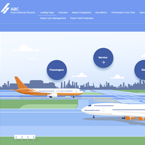
Highly infographic Dashboard used to showcase the travel industry and customer journeys.
Good for: Visual flexibility, slicing data

Discover how satisfied customers were during each step of their journey, from the website to the billing.
Good for: Drilldown functionality, comparisons/competitive sets