Infographic-based Storytelling
The Forsta Visualizations suite of reporting tools takes data in black and white and creates stories in color. Forsta Visualizations empowers users to create infographics that explain, inspire, and convince people to act on data. Show steps in a customer journey, spotlight the scale of an issue, communicate high-priority messages at a glance, or dive deeper and reveal overall trends in an interactive and engaging way. Take advantage of the flexibility of Forsta Visualizations and explore the different reporting tools offering a spectrum of delivery options from online dashboards to native PPT reports.
Innovations
AI-powered assistant to help analyze and improve your projects
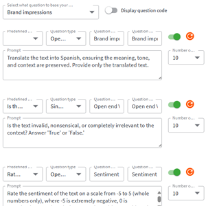
Surface key insights from open ended feedback using generative AI
Build your reports more efficiently through our enhanced user interface. point and click the elelemtns you’d like to build into your report
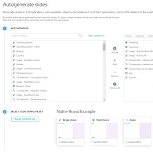
Autogenerate custom reports in record time and share via dashboard or editable PPT
Dashboarding & PPT
Tailor your reports by adding your own branding and corporate colors
Choose from a library of charting options and apply statistical analyses to enhance data quality through visual outputs
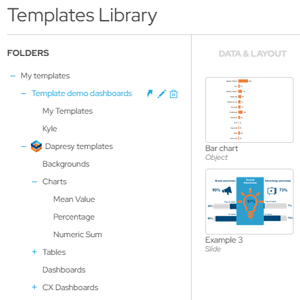
Create a library to reuse elements across reports and other projects

Slice and dice your data for richer insights and control data permissions across different stakeholders
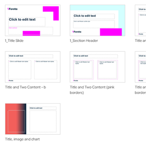
Import PPT master layouts to incorporate your branding into your slides
Generate an editable PPT report for offline viewing
Full control over application of statistical methods across the data
Animated chart loading for enhanced storytelling
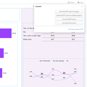
Crosstables
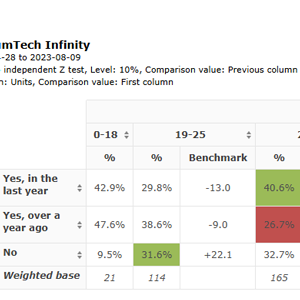
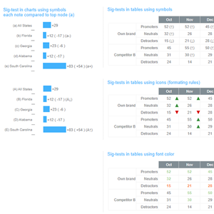
Use built in significance testing, benchmarking, percentiles, etc. for deeper analysis of your data
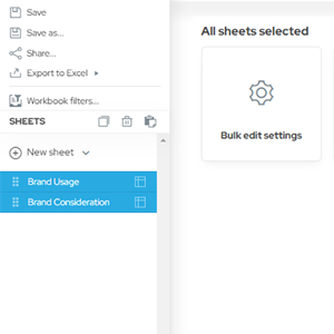
Modify all your worksheets at once through bulk editing
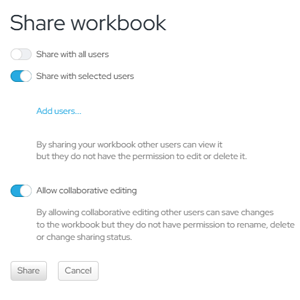
Collaborate with other users and share your crosstables with stakeholders
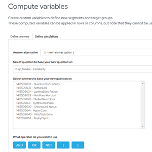
Create your own custom variables derived from survey dataset for targeted reporting
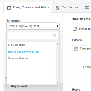
Save and reuse custom formatting to cut down on time and deliver more consistent crosstable reports
Data Integrations
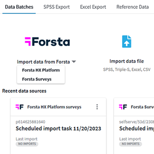
Connect natively to Forsta data or import externally collected data, including text analytics or benchmarks
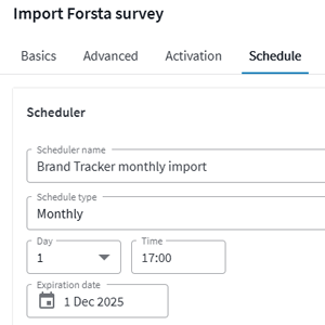
Configure the cadence of how often to update your Forsta dataset
Modify the structure and layout of your data using our native data transformation tool
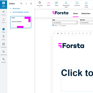
StoryCreator – PowerPoint Production Tool
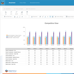
Explore a sandbox environment to create your own slides and crosstables
Brand Research Examples
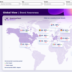
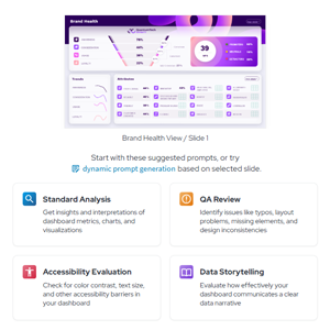
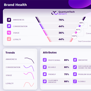
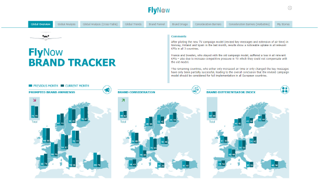
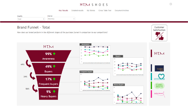
Global Brand Tracker, measuring key brand funnel KPIs across both regions and against competitors.
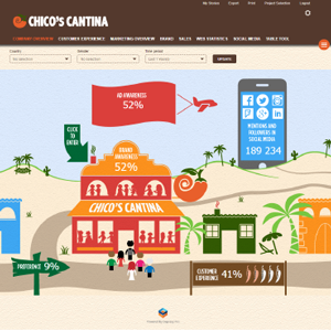
Vibrant dashboard, showcasing how visual, interactive, and custom-made you can be with our solution.
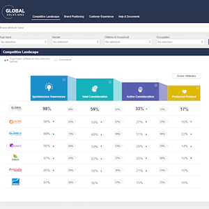
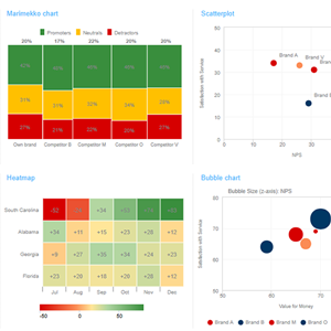
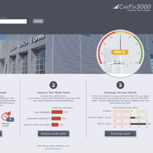
Get an instant look at the competitive landscape, including NPS score, consumer perception, and more.
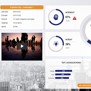
Visualize your ad testing and easily add non-survey data, including spending details, to get the whole picture.
Customer Experience Research Examples
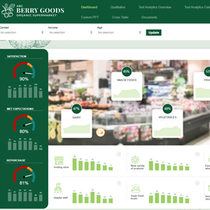
Customer Experience dashboard with both quantitative and qualitative views and highly visual reporting.
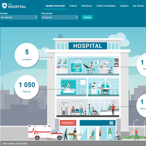
Explore the drill down functionalities for this Hospital chain Satisfaction Dashboard to view trends over time.
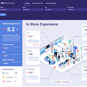
Identify key metrics and trends at a glance with wave-over-wave comparisons in this In-Store CX Dashboard.
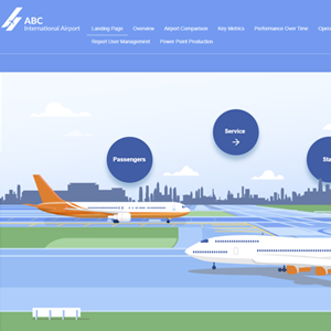
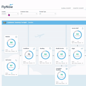
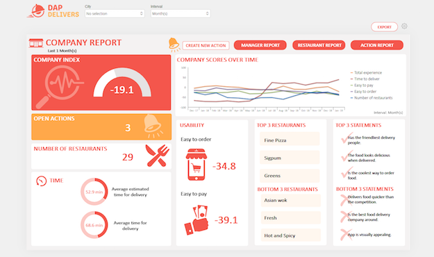
Highly infographic Dashboard used to showcase the travel industry and customer journeys.
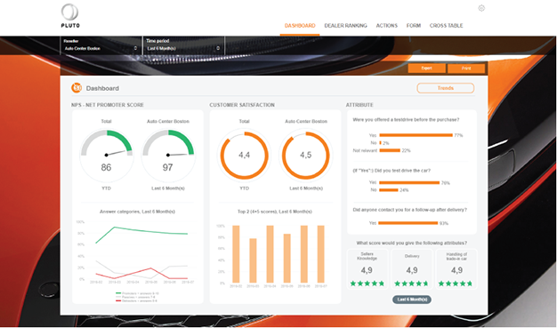
Comprehensive NPS Dashboard for users requiring different levels of access.
Discover how local store managers oversee customer feedback in a few clicks.
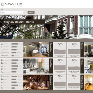
See how this luxury hotel chain keeps track of performance for each location and employee with its dashboard.

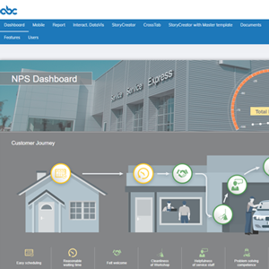
Discover how satisfied customers were during each step of their journey, from the website to the billing.